Wealth & Health of Philippine Provinces, v2 [INTERACTIVE CHART]
Posted: October 17, 2012 Filed under: Data Visualizations | Tags: Data visualization, gapminder Leave a commentSummary of changes:
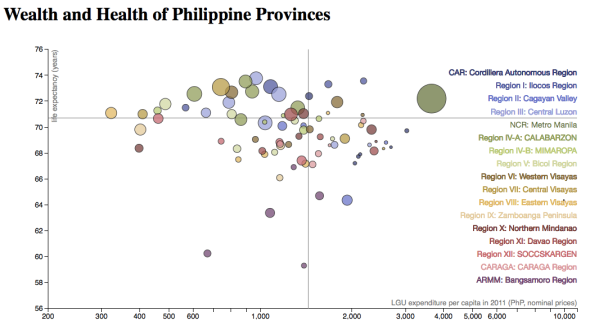
- LGU expenditure is now used as proxy for wealth, instead of LGU income (still, per capita).
- Metro Manila has been inserted in its “rightful” place in the order of regions, roughly from North to South.
- The new color scheme allows for “mental” grouping by geoegraphical region.
The bubbles are more spread out here. Clearly, budgets are not balanced (income not equal to expenditure), which is interesting in its own right.
Wealth & Health of Philippine Provinces [INTERACTIVE CHART]
Posted: October 17, 2012 Filed under: Data Visualizations | Tags: Data visualization, development, gapminder, hans rosling Leave a commentLast month, I posted graphics for a Gapminder-type Map of the Philippines. It was clear that an interactive version would make it easier to explore the data. Since then, I’ve picked up some d3js code to do precisely that. Here is the result:
Click to view the interactive version.*
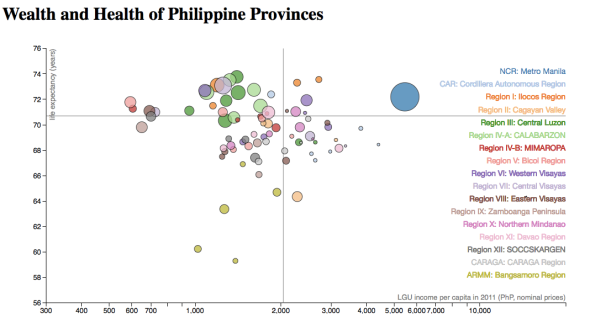
This chart shows the wealth and health of the 80 provinces of the Philippines, plus Metro Manila. Each province is represented by a bubble, whose size is proportional to its population. Average life expectancy in 2010 is used as a proxy for health, and the provincial LGU income per capita in 2011 is
used as a proxy for wealth.
To find your province, mouse over the region name on the right. You can also mouse over any bubble to identify the province and reveal related statistics.
Take note of the differences from region-to-region and from province-to-province. The horizontal and vertical lines mark national averages: life expectancy of 70.7 years (horizontal line), and provincial LGU income per capita of PhP 2,041 (vertical line). Note also that the (horizontal) income axis is logarithmic.
Data sources: National Statistics Office (NSO) for the population and life expectancy data, and Bureau of Local Government Finance (BLGF) for the LGU income data. The data and source code for the visualization are publicly available via GitHub.
Attributions: Chart concept from Hans Rosling and the Gapminder Foundation‘s world map.
Chart design from Mike Bostock’s d3 version.
*Unfortunately, I cannot embed it here on WordPress; I’m hosting it on dropbox for now, until it finds a more permanent home.
Gapminder-type Map of the Philippines
Posted: September 1, 2012 Filed under: Data Visualizations | Tags: Data visualization, development, gapminder, hans rosling 5 CommentsUPDATE (Oct-17-2012): An interactive version of this chart can now be found here.
“Is there anyone who ever remembers
changing their mind from the paint of a sign?”
— John Mayer (“Belief”)
What is a Gapminder-type map?
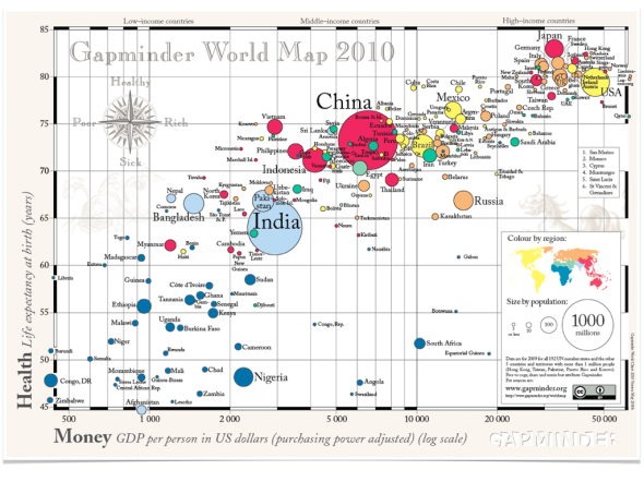
The Gapminder World Map changed my view of the world. It shows the relative wealth (GDP per capita) and health (average life expectancy) of 250+ countries and territories of the world. Based on 2010 data, the map shows that countries form an overall trend going from poorest/sickest to richest/healthiest:

Gapminder World Map (from http://www.gapminder.org)
Here is an animation showing how the map evolved from 1960 to 2010 (with the Philippines bubble highlighted– via Google Public Data Explorer). There is no division between the “developed” and “developing” worlds anymore– and the Philippines is right in the middle of the trend! Master-presenter Hans Rosling demonstrated the interactive and animated data visualizations they developed at the Gapminder Foundation in his 2007 TED talk. (Watch for the Philippines-U.S. comparison at the 4:47 mark. Then, look for his other TED talks too!)
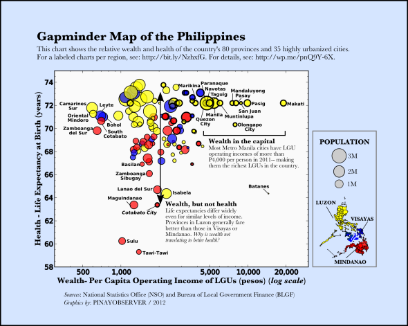
Inspired by the power of data to enlighten and inspire public discourse, I created a Gapminder-type map of the Philippines for 2012, showing the relative wealth and health of the different provinces and cities:
How to read this chart:
Each bubble is a province or highly urbanized city (HUC). There are 116 in all, showing 80 provinces, 35 HUCs, and 1 municipality (Pateros). The size of the bubble is proportional to the population of the city or province (excluding the HUC, if any; e.g., the population of Cebu city is not included in Cebu province). The color of the bubble is based on geographic location: yellow, blue, and red for Luzon, Visayas, and Mindanao.
The proxy for health is average life expectancy at birth (in years). The proxy for wealth is the annual per capita operational income of the city or provincial LGU (local government unit). LGU income sources include real property and business taxes, regulatory fees, service charges, and internal revenue allocation from the national government. For provinces with major component cities with reported incomes, the income from the cities are added to the provincial income.
Where did the data come from?
The goal was to show all provinces and HUCs, and to use the most up-to-date data available. Figures for population and life expectancies were taken from census data of the National Statistics Office (NSO) for 2010 (source), while LGU operational incomes were taken from the 2011 Statement of Income and Expenditures compiled by the Bureau of Local Government Finance (BLGF) (source -> “Fiscal Data”).
Where is my city/province?
These slides show different regions with labels– click through to find your favorite province or city (and click the fullscreen button on lower right to make slide larger):
Slide 2 shows NCR, and slides 4-19 show the other 16 regions, from CAR to ARMM. Slide 3 shows the 19 highly urbanized cities outside Metro Manila.
The slides are also posted HERE, and PDF files are downloadable here:
slide01-All Regions, slide02-NCR, slide03-HUCs outside NCR, slide04-CAR, slide05-Region I, slide06-Region II, slide07-Region III, slide08-Region IV-A, slide09-Region IV-B, slide10-Region V, slide11-Region VI, slide12-Region VII, slide13-Region VIII, slide14-Region IX, slide15-Region X, slide16-Region XI, slide17-Region XII, slide18-Region XIII, slide19-ARMM
What do we learn?
It is clear that the whole country cannot be fully represented by a single bubble. There is a large spread in wealth and health across the different provinces/cities. Of course, there are significant differences within each province and city as well (just look around!). Here, we average over those differences to focus on the differences between different provinces/cities within the country.
(1) Most Metro Manila cities are outliers in terms of LGU income per capita, and most highly urbanized cities are on the high side as well (see Slide 3). Makati City has the highest income per capita for 2011 (P20,000)– twice that of the next highest city, Pasig. (Note that the horizontal axis is in logarithmic scale!)
On the other end, seven outliers with less than P1,000 of LGU income per person are: Camarines Sur, Oriental Mindoro, Zamboanga del Sur, Leyte, South Cotabato, Bohol, and Tarlac (from lowest to highest income per capita). Despite, their low incomes, the average life expectancies of these provinces do not fall well below the national average (they range from around 70-72 years).
(2) Most LGUs fall between the range of P1,000 and P3,000 annual income per person. However, despite the similar levels of income, we find large differences in health outcomes– with average life expectancies ranging from 58 years to 74 years. Provinces in Luzon– with the exception of those in CAR (Cordillera Autonomous Region) and a few others– have high life expectancies, while those in Mindanao tend to have low values– especially, provinces in ARMM (Autonomous Region of Muslim Mindanao).
Lack of infrastructure (for health services, among others) and peace and order are most likely at play here. It seems that the point where wealth translates to health (if it exists– and the Gapminder world chart suggests that it does) has not been reached by most provinces, notably by those in CAR (which have relatively high income but relatively low life expectancies; see Slide 4).
(3) A lot of basic Philippine geography!
How does your hometown fare? Did you find anything that surprised you?
Caveats: Data analysis answers the question of what, not why– but any answer to why must at least be able to explain the what. Correlation does not imply causation.
A data graphic is only as good as its data. The data used in the above chart can be downloaded here. Below I describe them in more detail:
The average life expectancy figures are projections for 2010-2015 based on the 2000 NSO census. You may have noticed that all cities in Metro Manila are shown with the same life expectancy– the average for the region. HUCs outside Metro Manila are likewise shown with the average life expectancy of their parent province (including the HUC). I’m looking for disaggregated data for these cities, so the chart can be updated accordingly (perhaps, one of you can help!). There is no available figure for Dinagat Islands; here, I’ve shown the average for its region, CARAGA.
The LGU operating incomes are based on the 2011 Statement of Income and Expenses report (compiled by BLGF). For the 7 provinces, 7 cities, and 1 municpality with no reported figures for 2011, I use the most recent reported figures (ranging from 2007 to 2010).
Tools used to create this graphic: python matplotlib (for plotting), Inkscape (for illustration), Keynote (for creating slides), pdf2text.py (for data scraping).
Feedback wanted: Please share your comments, suggestions, and corrections (especially, corrections!). Subscribe here, on Facebook, or Twitter to get updates– interactive/animated visualizations are in the works.
To all who gave their input on the early drafts on Facebook– Salamat.
“Can I use this?”: Please feel free to share widely and use where relevant– but please attribute “kahit blogger lang ako”. 🙂
If there are improved or additional data you’d like to see here, please send an e-mail to: pinayobserver[at]gmail.com.
Short note on gov’t transparency (added 09/02):
Proper credit should go to the Bureau of Local Government Finance (BLGF) for making provincial, city, and municipality LGU statements of income and expenditures data available to the public (spreadsheets available in their website under “Fiscal Data”, starting from 2001). Also commendable is that they achieved a high compliance rate.
The provinces and cities that did not submit their reports should be called out, though. For 2011, among those with missing reports are 7 provinces: Agusan Del Sur, Antique, Dinagat Islands, Quezon, Romblon, Tawi-Tawi, and Zambales, and 7 highly urbanized cities: Angeles City, Cagayan de Oro City, Cebu City, Cotabato City, Manila City, Olongapo City, and Puerto Princesa City.
I plan to dig deeper into the data and show, for example, the percentage of expenditure each LGU devotes to different categories (as they appear on the statement of income and expenditure), including “Health, Nutrition & Population Control”, “Education, Culture & Sports/ Manpower Development”, “Housing and Community Development”, etc.


