Wealth & Health of Philippine Provinces, v2 [INTERACTIVE CHART]
Posted: October 17, 2012 Filed under: Data Visualizations | Tags: Data visualization, gapminder Leave a commentSummary of changes:
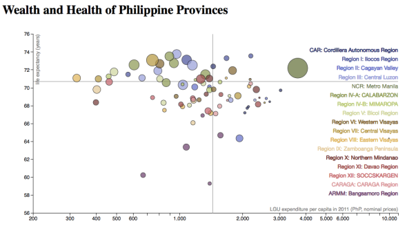
- LGU expenditure is now used as proxy for wealth, instead of LGU income (still, per capita).
- Metro Manila has been inserted in its “rightful” place in the order of regions, roughly from North to South.
- The new color scheme allows for “mental” grouping by geoegraphical region.
The bubbles are more spread out here. Clearly, budgets are not balanced (income not equal to expenditure), which is interesting in its own right.
Wealth & Health of Philippine Provinces [INTERACTIVE CHART]
Posted: October 17, 2012 Filed under: Data Visualizations | Tags: Data visualization, development, gapminder, hans rosling Leave a commentLast month, I posted graphics for a Gapminder-type Map of the Philippines. It was clear that an interactive version would make it easier to explore the data. Since then, I’ve picked up some d3js code to do precisely that. Here is the result:
Click to view the interactive version.*
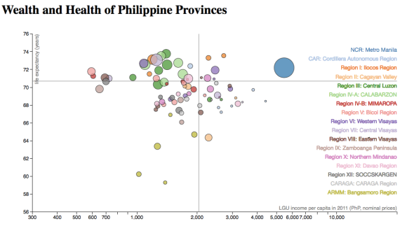
This chart shows the wealth and health of the 80 provinces of the Philippines, plus Metro Manila. Each province is represented by a bubble, whose size is proportional to its population. Average life expectancy in 2010 is used as a proxy for health, and the provincial LGU income per capita in 2011 is
used as a proxy for wealth.
To find your province, mouse over the region name on the right. You can also mouse over any bubble to identify the province and reveal related statistics.
Take note of the differences from region-to-region and from province-to-province. The horizontal and vertical lines mark national averages: life expectancy of 70.7 years (horizontal line), and provincial LGU income per capita of PhP 2,041 (vertical line). Note also that the (horizontal) income axis is logarithmic.
Data sources: National Statistics Office (NSO) for the population and life expectancy data, and Bureau of Local Government Finance (BLGF) for the LGU income data. The data and source code for the visualization are publicly available via GitHub.
Attributions: Chart concept from Hans Rosling and the Gapminder Foundation‘s world map.
Chart design from Mike Bostock’s d3 version.
*Unfortunately, I cannot embed it here on WordPress; I’m hosting it on dropbox for now, until it finds a more permanent home.
Volcano Eruptions since 1900 [VIDEO]
Posted: September 15, 2012 Filed under: Data Visualizations | Tags: animation, geology, natural disasters, Processing, volcanoes 2 CommentsWatch the history of volcano eruptions in the Philippines since 1900– in less than 30 seconds:
You just saw 96 volcano eruptions over the last 112 years– an average of 1 for every two years. The most active volcanoes are Mayon and Kanlaon– tied in first place with 24 eruptions each since 1900, followed by Bulusan and Taal. Together, these four volcanoes account for 71 eruptions or 3/4 of the total, with the rest divided among nine other volcanoes. (Eruption history data shown here are from the Smithsonian’s Global Volcanism Project records.)

- Huge ash cloud over Mt. Pinatubo on June 12, 1991,
- three days before the climactic eruption.
The eruption of Mt. Pinatubo on June 1991 is by far the most cataclysmic in the country– it was the second-largest eruption of the century and its effects were felt worldwide. The eruption ejected some 10 cubic kilometers of material (imagine filling a box that is 2 km on each side!), giving it a Volcanic Explosivity Index (VEI) of 6. This is a hundred times more material than that for the next largest eruption, Taal in 1965, which had a VEI of 4. (Like the Richter magnitude scale for earthquakes, the VEI scale is logarithmic. Note, though, that in the video, the bubble sizes do not increase tenfold from one VEI magnitude to the next, but increase linearly with VEI.*)
The most recent eruption is of Mt. Bulusan in Sorsogon on February 2011, with a listed VEI of 2. According to various reports, the eruption affected 17 nearby towns with over 100,000 people– and over 2,000 people were called to evacuate.

Mt. Bulusan erupting on February 21, 2011
I wonder how many Filipinos live around active volcanoes. Worldwide, the number is estimated to be 500 million. I visualize a map with circles around the most active volcanoes, sized according to the number of people who would be affected by an eruption of a certain VEI (say, from 0 to 4).
PHIVOLCS (Philippine Institute of Volcanology and Seismology) is responsible for monitoring volcano activity and issuing regular volcano bulletins. There are hazard maps for individual volcanoes like this one for Mt. Kanlaon. I’ll find out if they can make (or, have already made) the population figures available too.
.
* A VEI = 1 bubble is twice as big as a VEI = 0 one, a VEI = 2 bubble is three times as big, and so on. If the bubble sizes were shown accurately in tenfold size increases, the biggest eruptions will completely fill the screen– and well beyond!
Rise of the SM Supermalls [VIDEO]
Posted: September 5, 2012 Filed under: Data Visualizations | Tags: animation, Processing, SM malls Leave a commentWatch the rise of SM Supermalls over the country:
There will be 47 malls by the end of the year– and 7 more are planned for over the next few years.
We see that most of them are clustered around Metro Manila and its “suburbs”. So, I also made this zoomed-in version (added 09/05):
There are only 7 malls outside Luzon, with two more set to open soon. SM Lanang Premiere in Davao City is under construction and SM Seaside City Cebu– which will have a (slightly) bigger floor area than SM Mall of Asia– is expected to open in 2014.
As of 2012, the total floor area of SM supermalls add up to around 5.5 sq. km– large enough to cover most of the City of San Juan, Metro Manila! For better or for worse, SM malls have made an imprint in the country’s geography– and its culture.
For an interesting comparison, watch the growth of Walmart over the U.S.
.
.
(Source of all data and information: Wikipedia, so take with a grain of salt.)
Growth of the PSHS System [VIDEO]
Posted: September 2, 2012 Filed under: Data Visualizations | Tags: animation, Processing, PSHS 4 Comments“As we reach for our dreams,
as we strive for our goals
As we search for the untarnished truth”
— from the PSHS hymn, written by Mario Taguiwalo
What is the PSHS system?
The Philippine Science High School system (PSHS for short, or colloquially, “Pisay”) is a “specialized public high school system in the Philippines” (Wikipedia)– akin to magnet schools in the U.S. PSHS offers scholarships to all students, selected through a competitive national exam (with a 7% admission rate*).
The first campus was founded in Diliman, Quezon City in September 1964. After 24 years, the first regional campus– the Southern Mindanao campus– was established in Davao City. The national plan is to establish a campus in each of the 17 regions of the country. Today, there are 11 regional campuses in all, with around 3,800 student-scholars enrolled. Two additional campuses are set to open by 2014– in Tagaytay City, Cavite (CALABARZON Region Campus) and Zamboanga City, Zamboanga del Sur (Zamboanga Peninsula Region Campus).
This video shows the growth of the PSHS system to 11 existing and 2 planned PSHS campuses. The size of the circles is proportional to the number of enrolled students (for the school year 2011-2012).**
The last frame of the video can downloaded– and used as a data graphic– here.
How many scholars?
One of the (many) good things about Pisay (as we, scholars, affectionately call it) is that class sizes are limited to at most 30 students. The main campus at Diliman is the largest in terms of student body, with 8 sections for a total of around 960 students in total (8 sections x 30 students x 4 years of HS). The other campuses have 3 sections per year, or around 350 students in total. The newer campuses are still “filling in” their upper years, but are building toward that number. In total, more than 3,800 students are enrolled in the 11 campuses. Among them are our future scientists, innovators, leaders, and changemakers.
It would be interesting to estimate many PSHS alumni there are today. Assuming the same number of students from the beginning, we get an upper limit of 21,500. Since the Diliman campus started out with fewer students, the number is probably closer to 15,000 alumni or 1 for every 60,000 Filipinos.***
Appeal to reader:
If you are a Pisay scholar– like me– please appreciate how lucky this makes you. I used to cringe at the cliche they repeated like a mantra then: “To whom much is given, much is required”. Now, 12 years wiser, I understand, and humbly accept.
If you have a child, cousin, niece, nephew, young neighbor, or friend who shows interest and aptitude for science, I encourage you to tell him or her about Pisay– and the possibilities that await.
If you are one, yourself, I encourage you to apply! 🙂
*
*
*The figure 7% was estimated from the Wikipedia figure of 17,000 test-takers per year, i.e., (240+11 x 900)/17,000.
**Data used to create this graphic is available here: pshs_enrollees_2011-2012.xls. Thanks to the PSHS System Office of the Executive Director for providing enrollee information. The video was made using Processing.
***As always, comments and corrections are most welcome!
Gapminder-type Map of the Philippines
Posted: September 1, 2012 Filed under: Data Visualizations | Tags: Data visualization, development, gapminder, hans rosling 5 CommentsUPDATE (Oct-17-2012): An interactive version of this chart can now be found here.
“Is there anyone who ever remembers
changing their mind from the paint of a sign?”
— John Mayer (“Belief”)
What is a Gapminder-type map?
The Gapminder World Map changed my view of the world. It shows the relative wealth (GDP per capita) and health (average life expectancy) of 250+ countries and territories of the world. Based on 2010 data, the map shows that countries form an overall trend going from poorest/sickest to richest/healthiest:
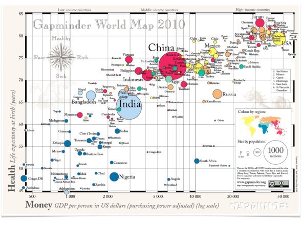
Gapminder World Map (from http://www.gapminder.org)
Here is an animation showing how the map evolved from 1960 to 2010 (with the Philippines bubble highlighted– via Google Public Data Explorer). There is no division between the “developed” and “developing” worlds anymore– and the Philippines is right in the middle of the trend! Master-presenter Hans Rosling demonstrated the interactive and animated data visualizations they developed at the Gapminder Foundation in his 2007 TED talk. (Watch for the Philippines-U.S. comparison at the 4:47 mark. Then, look for his other TED talks too!)
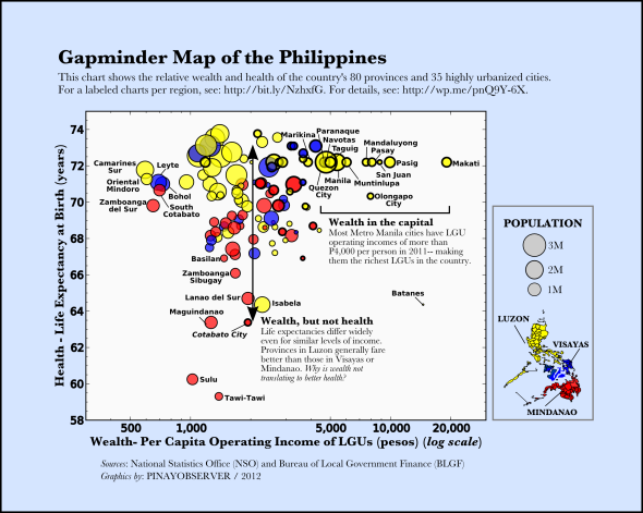
Inspired by the power of data to enlighten and inspire public discourse, I created a Gapminder-type map of the Philippines for 2012, showing the relative wealth and health of the different provinces and cities:
How to read this chart:
Each bubble is a province or highly urbanized city (HUC). There are 116 in all, showing 80 provinces, 35 HUCs, and 1 municipality (Pateros). The size of the bubble is proportional to the population of the city or province (excluding the HUC, if any; e.g., the population of Cebu city is not included in Cebu province). The color of the bubble is based on geographic location: yellow, blue, and red for Luzon, Visayas, and Mindanao.
The proxy for health is average life expectancy at birth (in years). The proxy for wealth is the annual per capita operational income of the city or provincial LGU (local government unit). LGU income sources include real property and business taxes, regulatory fees, service charges, and internal revenue allocation from the national government. For provinces with major component cities with reported incomes, the income from the cities are added to the provincial income.
Where did the data come from?
The goal was to show all provinces and HUCs, and to use the most up-to-date data available. Figures for population and life expectancies were taken from census data of the National Statistics Office (NSO) for 2010 (source), while LGU operational incomes were taken from the 2011 Statement of Income and Expenditures compiled by the Bureau of Local Government Finance (BLGF) (source -> “Fiscal Data”).
Where is my city/province?
These slides show different regions with labels– click through to find your favorite province or city (and click the fullscreen button on lower right to make slide larger):
Slide 2 shows NCR, and slides 4-19 show the other 16 regions, from CAR to ARMM. Slide 3 shows the 19 highly urbanized cities outside Metro Manila.
The slides are also posted HERE, and PDF files are downloadable here:
slide01-All Regions, slide02-NCR, slide03-HUCs outside NCR, slide04-CAR, slide05-Region I, slide06-Region II, slide07-Region III, slide08-Region IV-A, slide09-Region IV-B, slide10-Region V, slide11-Region VI, slide12-Region VII, slide13-Region VIII, slide14-Region IX, slide15-Region X, slide16-Region XI, slide17-Region XII, slide18-Region XIII, slide19-ARMM
What do we learn?
It is clear that the whole country cannot be fully represented by a single bubble. There is a large spread in wealth and health across the different provinces/cities. Of course, there are significant differences within each province and city as well (just look around!). Here, we average over those differences to focus on the differences between different provinces/cities within the country.
(1) Most Metro Manila cities are outliers in terms of LGU income per capita, and most highly urbanized cities are on the high side as well (see Slide 3). Makati City has the highest income per capita for 2011 (P20,000)– twice that of the next highest city, Pasig. (Note that the horizontal axis is in logarithmic scale!)
On the other end, seven outliers with less than P1,000 of LGU income per person are: Camarines Sur, Oriental Mindoro, Zamboanga del Sur, Leyte, South Cotabato, Bohol, and Tarlac (from lowest to highest income per capita). Despite, their low incomes, the average life expectancies of these provinces do not fall well below the national average (they range from around 70-72 years).
(2) Most LGUs fall between the range of P1,000 and P3,000 annual income per person. However, despite the similar levels of income, we find large differences in health outcomes– with average life expectancies ranging from 58 years to 74 years. Provinces in Luzon– with the exception of those in CAR (Cordillera Autonomous Region) and a few others– have high life expectancies, while those in Mindanao tend to have low values– especially, provinces in ARMM (Autonomous Region of Muslim Mindanao).
Lack of infrastructure (for health services, among others) and peace and order are most likely at play here. It seems that the point where wealth translates to health (if it exists– and the Gapminder world chart suggests that it does) has not been reached by most provinces, notably by those in CAR (which have relatively high income but relatively low life expectancies; see Slide 4).
(3) A lot of basic Philippine geography!
How does your hometown fare? Did you find anything that surprised you?
Caveats: Data analysis answers the question of what, not why– but any answer to why must at least be able to explain the what. Correlation does not imply causation.
A data graphic is only as good as its data. The data used in the above chart can be downloaded here. Below I describe them in more detail:
The average life expectancy figures are projections for 2010-2015 based on the 2000 NSO census. You may have noticed that all cities in Metro Manila are shown with the same life expectancy– the average for the region. HUCs outside Metro Manila are likewise shown with the average life expectancy of their parent province (including the HUC). I’m looking for disaggregated data for these cities, so the chart can be updated accordingly (perhaps, one of you can help!). There is no available figure for Dinagat Islands; here, I’ve shown the average for its region, CARAGA.
The LGU operating incomes are based on the 2011 Statement of Income and Expenses report (compiled by BLGF). For the 7 provinces, 7 cities, and 1 municpality with no reported figures for 2011, I use the most recent reported figures (ranging from 2007 to 2010).
Tools used to create this graphic: python matplotlib (for plotting), Inkscape (for illustration), Keynote (for creating slides), pdf2text.py (for data scraping).
Feedback wanted: Please share your comments, suggestions, and corrections (especially, corrections!). Subscribe here, on Facebook, or Twitter to get updates– interactive/animated visualizations are in the works.
To all who gave their input on the early drafts on Facebook– Salamat.
“Can I use this?”: Please feel free to share widely and use where relevant– but please attribute “kahit blogger lang ako”. 🙂
If there are improved or additional data you’d like to see here, please send an e-mail to: pinayobserver[at]gmail.com.
Short note on gov’t transparency (added 09/02):
Proper credit should go to the Bureau of Local Government Finance (BLGF) for making provincial, city, and municipality LGU statements of income and expenditures data available to the public (spreadsheets available in their website under “Fiscal Data”, starting from 2001). Also commendable is that they achieved a high compliance rate.
The provinces and cities that did not submit their reports should be called out, though. For 2011, among those with missing reports are 7 provinces: Agusan Del Sur, Antique, Dinagat Islands, Quezon, Romblon, Tawi-Tawi, and Zambales, and 7 highly urbanized cities: Angeles City, Cagayan de Oro City, Cebu City, Cotabato City, Manila City, Olongapo City, and Puerto Princesa City.
I plan to dig deeper into the data and show, for example, the percentage of expenditure each LGU devotes to different categories (as they appear on the statement of income and expenditure), including “Health, Nutrition & Population Control”, “Education, Culture & Sports/ Manpower Development”, “Housing and Community Development”, etc.
SONA noon, SONA ngayon
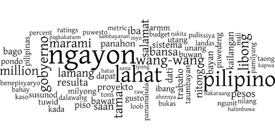
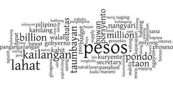
Posted: August 3, 2011 Filed under: Data Visualizations | Tags: infographics, SONA, wordle 9 CommentsLast week, President Noynoy* Aquino delivered his 2011 State of the Nation Address (SONA) in Filipino (or Tagalog, if you prefer). I made a word cloud (a.k.a. wordle) of the speech (full transcript here):
The word cloud shows the most frequently used words in the speech, after removing commonly-used Filipino words (including “ang”, “sa”, “at”, etc.). Intuitively, words that were used more frequently appear larger. In the 2011 speech, there seemed to be an emphasis on “pilipino” and “wang-wang”.
I thought it would be interesting to compare this with the President’s SONA from a year ago (full transcript here). Here is the word cloud for the 2010 SONA:
Compared to the 2011 SONA, there seems to be more of an emphasis on money here, with “pesos” and “pondo” being the two most frequently-used words. Also, it looks like the use of the word “taumbayan” was replaced by the word “pilipino” in the more recent speech— a welcome change.
Of course, nothing beats a close listening and reading of the speeches (and checking the facts behind them), but visualizing the speeches this way makes certain things pop out— literally.
What other patterns do you see? Which speech did you like better?
—–
*Yes, we Filipinos call our presidents by their nicknames. That’s just the way we roll… 😉
Siniksik na Pilipinas
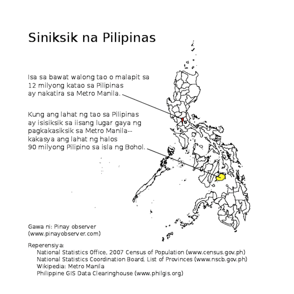
Posted: August 2, 2011 Filed under: Data Visualizations | Tags: infographics, map, population 17 CommentsA thought experiment: what if all of RP were concentrated in a single island?
Ready for some math?
First, let’s look at the population counts. As of the NSO census of 2007:
- Population of RP = 88,566,723
- Population of Metro Manila = 11,566,325
This means that 13 per cent of Filipinos live in Metro Manila, or around 1 in 8 people!
Now, how do the land areas compare?
- Land area of RP: 299,764 sq. km
- Land area of Metro Manila: 636 sq. km
This means that Metro Manila is only 1/500 of the country’s total land area or 5% of Luzon.
Dividing the population by the land area gives us the average number of people per square km, or population density:
- Population density of RP: 295 people per sq. km
- Population density of Metro Manila: 18,170 people per sq. km
Metro Manila is 60 times more dense than the country as a whole!
If you fit all 88 million Filipinos with the population density of Metro Manila, the land area they will occupy is (88 M/11 M) x 636 sq. km = 4,875 sq. km. This is just a bit larger than the land area of Bohol, which is 4,821 sq. km.
Finally, I leave you with a bit of global perspective: Metro Manila is the 11th most populous metropolitan area in the world and one of the densest. Tokyo is the most populous– with 32 million inhabitants (3 times more than Metro Manila)– but Metro Manila is 4 times more densely-populated!
(Inspired by maps of “The World’s Population, Concentrated” at Per Square Mile.)
One infographic at a time
Posted: August 2, 2011 Filed under: Uncategorized 2 CommentsAfter a hiatus, Pinay observer is back with a new mission: making sense of being Filipino in today’s world— one infographic at a time. Stay tuned!
